Thursday, January 26, 2012

Creating Painting Like Effect using Adobe Photoshop Lightroom 3

Used the photoshop tools for creating painting like effect but nothing is as easy as compared to using Adobe Photoshop Lightroom 3 tool sliders to create a mesmerizing effect of a painting...

So here goes the tutorial.

1) Select the photo which you want to import.


After Importing the photo, switch to the Develop mode on the top right panel.

2) What I did here is recovered all the lost image data due to the brightness coming on the lens of the camera.
Recovery = 100


3) Then I switched to Contrast Slider and increased the contrast so that I can view considerable difference between the colours.
Contrast: 75 - 90


4) Then I came to my Vibrance slider and increased that slider to about 50 - 70.
Vibrance = 59


5) Then slide down to the Details panel


Open the details panel by clicking on the small triangle on the right of it.

6) Then I reduced the Details in the photograph that were present due to good quality of lens and camera.
Detail = 10 - 15


Here is your final result.


You can play around with the sliders and get some effects in tandom.

I have a second illustration which really turned out much better than expected.


Saturday, October 8, 2011

Beautiful TYPOGRAPHY

        Just-in-case if you are a designer, you do not want to miss this post. Its 'Typography' time. Working with different typefaces gets more complex as you have to be very much careful about the combinations of the fonts. But one thing that I would like to add to that is it is one of the main building blocks of the designing. So this post is like just a big picture of what you would see in any of the typography courses. So lets begin.
         
        So, whenever you enter in the field of typography you have a lot of anatomy to learn or even you might come across some of the most geekiest terms that you might have ever heard associated with the fonts. Here are a few of them that I would like to mention:         


> Baseline: all lower case letters rest on say ‘c’
> Descended  line: lowest point of a character say ‘y’
> X-height: height of the lower case letter ‘x’
> Cap height: top of the capital letter. ‘T’
> Ascender height: maximum height ‘h’
 Figure 1: Showing all all different terminologies used in typography.


         Some typefaces have 'serifs'. Just look at the bottom part of 'p' character in the next figure.

Figure 2: 'serifs' in character 'p' and other GEEKY terms related to font


  Figure 3: Some of the special terms in the character 'g'
        The circular closed face shown in the counter is known as 'counter'. Just a quick knowledge based question:
Q: What is the 'dot' on the top of 'i' called?
A: Tiddle. 


        Now I would just like to make a difference pointed out here. You all might have heard about 'typefaces' or 'font' but actually both of them are different. Here is how:

                                       Figure 4: Difference between the 'typeface' and 'font'

        Typeface is a peculiar design while font is a peculiar font within that design. Minion/Myriad are typefaces. When you see Minion Bold its a font in Minion Typeface. There are 1000s of typefaces that are spread around and which are basis for again 100s of 1000s of fonts.

        Again, if you have heard about: Serif and San Serif, both are different again. Serifs are with 'twirls' and San Serifs are with 'no twirls'.


        Also, looking at the measurement system, 'Points' vs 'Picas' are different too.

Figure 5: Difference between the 'typeface' and 'font'
        The 'Points'(seen in Word, Adobe InDesign) were used when in early years when printing was done by using metallic mold of the characters(what height you want to have to handle the character). Hence 200 point(pt) of one font may not be equal to 200 point(pt) of other font.
  Figure 6: Notice the difference in size as both fonts are in 200 pt  

  Figure 7: Carved Letters
 
            Counter is larger(enclosed part of the letter).


  Figure 8: Counter of 'g' is larger
         Now here comes some of the mathematical terms about the fonts and their sizes:
> Cap height of 100 pt font: 70% of pt(other fonts may be +-10%)
> X-Cap = X height = 70% of cap height

       Say we want to use myriad and minion fonts together as the headlines and as the body text. Hence, in-order to avoid the difference we reduce/increase the size of the fonts till the X height matches.

         Here are a few terms that would help you in the paragraph level formatting:
> Kerning: space between 2 characters, tighter looser…(serifs and headlines)
> Tracking: space in range of characters. (Body Text)
> Word Spacing: Word spacing should be done properly.
> Leading: Space between lines


Figure 9: Different formatting/spacing terms
         Every font has these characteristics. Hence it is advisable to use them wisely and carefully before you end up in an entangled manner.
  
         Ok! so swaying just a bit away from these geeky technical terms, you might be wondering why there are some fonts that we have to pay for?!! Well, it actually goes like this: The font characters need to have proper spacing. Hence current pairs(mathematical spaces) between 2 characters is decided at different sizes of the font and this is a painful task. #Sad. Hence these fonts are paid and they have these inbuilt pre-defined characteristics of paragraph level formating. Hence, whenever you are buying a font you are buying yourself time against the painful alignment task.

        Now, all the default font settings have 'Metrics' spacing. Just for the example, look at the image below:
  Figure 10: 'Metrics' Character level spacing
          Just as you can see, whenever I place my font over the background of the colour or text there is some unwanted gaps between the characters. 
> 'Ty': too far…
> 'yp': too close
> 'po': too far
> 'og': too far
> 'phy': far
  
       So, just as when you set your spacing options to 'Optical' *(Only for InDesign Users) what the Adobe Type Engine does is it compares the background with the text and then tries to optimize the inter-character spacing so as the effect of the background colour does not overshadow the text that has to be read.
Figure 11: 'Metrics'(Top Typo) vs 'Optics'(bottom Typo) 

        And above all, when you have a huge amount of text on the paste board, it does not take processing hit. 
       
        For script type faces: Metrics(default)(hand written) don’t make it optical(breaks).

  Figure 12: Bad effect of 'Optics' on the hand written font 
 
          Lastly, the leading size must be kept at +2 or +3 the size of the font. This enhances the readability of the article as it emphasizes the font. Also, you can use the optical margin alignments to remove the non-hanging quote marks.
Figure 13: Hanging Quote marks

Friday, April 29, 2011

Cube of Magical Moments

Hye guys, this is a really simple tutorial using ID CS5 where you can make a decorative cube following few simple steps...... I hope you enjoy it and please please do perform the tutorial.....


----------------------------------------------------------------------------------------------


Step 1

Create an InDesign CS5 Document and use the landscape layout for A3 page as shown in the figure. Feel free to scale it as per your print requirements but the standard photographic development includes 12x15 inch development.


---------------------------------------------------------------------------------------------- 


Step 2

With the blank document active you select 6 of your photos which are memorable and you want to place them in the cube…. After selecting these photos make sure it is in the square orientation…


Note : Avoid skewing the photographs. It’ll give an ugly look to the cube if the faces are broader or taller than usual… Make sure the aspect ratio  is maintained so as the photos are not distorted. You can try cropping the photographs which can be useful to get the square orientation.


----------------------------------------------------------------------------------------------  

Step 3

After you are done arranging them in square orientation (it’s obvious that you keep the dimensions same for the cube) make the array of the photographs as shown in the above figure. Arrange properly so that all the photos are aligned in a straight fashion. Use Object Align Panel which can give you the exact alignment. Make sure that you keep some distance between the photos so that the cube bends do not affect the actual photographs.


----------------------------------------------------------------------------------------------  


Step 4

Make the hinges in the photographs as shown in the figure so that you can use them to glue the sides.


----------------------------------------------------------------------------------------------  


Step 5

After being done with this, export it to the JPEG format make sure you are using a maximum or a high quality for the photographs so as the pictures appear crystal clear.


----------------------------------------------------------------------------------------------  


Step 6

Send it for the development at your nearest studio or print the photograph.

Note : It is advisable that you use the photographic paper so as the cube would be strong enough. 

----------------------------------------------------------------------------------------------  


Step 7

And yay!!! The photograph is developed….. Now it’s the task that we used to do it in nursery. The Crafting. Cut it by the edges(don’t cut the hinges) and glue the sides by the hinges.

Your box it ready. Use it as your decorative tool for your work table or hang it by a thread.


The Result


Sunday, April 24, 2011

Get Your Hands on TYPOGRAPHY with ID-CS5


Adobe InDesign CS5, Advanced Typography and Special Characters


Adobe’s InDesign is considered to be the most advanced multi-page editor software, but we need to take advantage of it’s full power to quickly create and deliver professionally formatted documents. In this article, we’ll review the nine advanced and special character topics, as well as corresponding shortcut keys, and additional information.


Scope and Focus of this Article


Most of the features explained in this article are general typography rules that will apply to any word processor, while some are only available in the Adobe CS suite, including InDesign and Illustrator. Also, some of the features are only available with Open Type fonts, which contain an extended character set including a number of special characters not available in other types of fonts.

To be noted that while extensive information on each of the following aspects is widely available, this article is just a short roundup of various typesetting features, and it should be treated as a checklist of things to remember when designing and reviewing a document.

Many times when working on large volumes of text or very tight deadlines, designers tend to ignore these aspects, however it is what makes the difference between a professional looking design and an average document. This article assumes you know the basics of working with Character and Paragraph Styles, and goes a bit beyond that.


Grid and Paragraph Style Rules


A few general rules to keep in mind when setting up your grid and paragraph styles:

Your body text Paragraph Style should be defined first. Usual font settings for body text include 8/10 (meaning: font size/leading), 9/11 or 10/12, but feel free to pick any combination that would best fit your content and design.


Your body text leading affects the baseline grid and other layout issues, so it’s best you set this correctly when starting a new document.


Always use Optical kerning for all your Paragraph Styles. This ensures the optimal distance between letters, as defined by the typeface designer. You normally don’t need to alter this distance unless you really know what you’re doing. There are two additional kerning options available – Auto and Manual – Auto works similar to Optical, while Manual lets you adjust the spacing manually. But really, Optical should be ideal in most cases.


Never add tracking to your lowercase body text Paragraph Style. The font designer has already defined the optimal letter spacing built into the font, so you don’t have to worry about that.

You can, however, slightly track words in uppercase, titles and numbers throughout the document. You can set different letter spacing settings for each paragraph/character style you define, depending on it’s importance.


Don’t use more than 50–70 characters per column for body text (ideally around 60). More than that would make rows too long and difficult to follow, especially for large volumes of text, such as books and annual reports. If using multiple columns, 40–50 characters per column should be your limit.

If you plan on using justified text, keep in mind that works best for wide columns and is not recommended for narrow, multi-column designs. Also, avoid having hyphens on consecutive rows, since that creates on optical ‘gap’ on the edge of the text frame.

Show Hidden Characters


Before reading any further, make sure you activate the Hidden Characters feature, which will allow you to see the special non-printing characters (marked in blue) in your text boxes. You can do that by choosing Type > Show Hidden Characters from the main menu, or using the shortcut Command + Alt + I. Keep in mind that these characters won’t show up in InDesign’s Preview mode, so you might also need to switch back to Normal mode by pressing the W shortcut if you can’t see them..


1. White Space


The traditional space character is good most of the time for the main body of text, however there are cases when you need a wider/narrower space between some words.


While adding multiple consecutive spaces or changing the tracking setting are totally unprofessional and can create style overrides, luckily there are more elegant solutions for this problem. You can insert all the following spaces by choosing the options under Type > Insert White Space from the main menu.

Em space – virtually a blank square the size of the capital M in your selected typeface and point size. For a 12pt font size, an Em space will take up a width of 12pt. Frequently used as a measure for paragraph indents (Shift + Command + M).


En space – another blank space, half the width of the Em space, as defined above. For a 12pt font size, an En space will take up a width of 6pt. It’s used to create a bigger gap between certain words or special characters (Shift + Command + N).


Additionally, there are other narrower spaces, such as Third/Quarter/Sixth/Thin/Hair Space, which correspond respectively to 1/3, 1/4, 1/6, 1/8, 1/24 the width of an Em space.


A Punctuation space is as wide as comma or a colon. A Figure space is as wide as a figure character in your font, and it’s helpful for aligning numbers in tables.


Non-breaking space – normal width space that prevents words from breaking up at the end of a line. For instance if you have “3,300 USD” you might not want “USD” to drop to the next line, so you replace the space before “USD” with a Non-breaking space.


2. Hyphens and Dashes


There is some confusion regarding the difference between hyphens, dashes and various resembling math symbols. While every font has a number of hyphen-like characters included, only a few of them are commonly used:


Normal hyphens are used to split hyphenated words at the end of a line, or to join compound words or terms, like: “actor-director”. There is also a Non-breaking hyphen, which is in fact a normal width hyphen that prevents words from breaking up at the end of a line. You might need this for terms like “Pan-American” which must not be separated at the end of a line. This symbol keeps the words on the same line, and can be inserted instead of a normal hyphen via Type > Insert Special Character > Hyphen and Dashes > Non-breaking hyphen.


The Minus sign is used in math expressions or body text/tables to represent negative numbers (UNICODE U+2212).


There are however some situations when you need to transform regular hyphens into wider dashes, either by hand or using a search and replace on longer documents. Em and En dashes are by far the most useful:

Similar to an Em space, an Em dash is as wide as the uppercase M letter in your selected font at your selected font size. It is mainly use to mark a pause in the text, like this: “Lorem ipsum dolor — sit amet — lorem ipsum.” The shortcut to insert a Em dash into a text box is Alt + Shift +/-.


An En dash is half the width of the Em dash, and is used to define a range between 2 values. For example: “18–19 July,” years “2000–2011.” The shortcut is Alt +/-.

Both Em and En dashes can be included between Thin spaces to give them a bit of room to breathe, but this is just a matter of personal taste. Personally I prefer to use Thin spaces around dashes.

In recent times it is common that you use Em dashes instead of the regular bullet points to build a more contemporary list style.


A few examples of the elements we’ve explained so far, with the Hidden Characters feature turned on: An Em dash; A Non-breaking space – these words will stick together no matter the width of the text box; Em dashes in between Thin spaces; Normal spaces are marked by a simple dot.


3. Ligatures


Ligatures are pairs of two or three letters joined together into a unique shape. Most common ligatures start with the letter f: fi, fl, ff, ft, fb, fh, fk, ffi, ffl. It is recommended you always use Open Type ligatures whenever they are available in your selected typeface, by checking the Ligatures option in the Character Panel or the Paragraph Style Options dialog box.


4. Smallcaps


Smallcaps are alternative characters that are as high as regular lowercase characters and are used to highlight certain words or titles in your document. They are especially useful for acronyms; like: UNICEF, USA, NATO.


You can add a bit of tracking to acronyms in your document using a custom Character Style. People’s names can also be set in Smallcaps. For name initials such as E.M. Hemingway usually no space is required between E.M. Some designers prefer to use a Thin or Hair space in between these initials, but that depends on the font used and is a matter of personal preference.


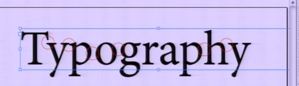
5. Optical Margin Alignment


This is a very useful feature that will add a professional look to your text boxes by slightly pushing punctuation marks and some wide uppercase letters outside the text box, to visually align the text. They are especially handy for quotes enclosed in quotation marks, which will be hanging outside the box as shown above. Bring up the Window > Type & Tables > Story Panel, check Optical Margin Alignment, and enter the font size you are using for that particular paragraph.


6. Glyphs


The glyphs panel (Alt + Shift + F11) browses through the entire character set of a selected font, revealing an extended list of available characters you can use, which are not readily available on the keyboard. Just click in a text box, then double-click on a glyph to insert it at the cursor location. Let’s look at the panel explained in detail:


Font selector – when you bring up the window it automatically selects your current typeface, but you can change it here.


Font width selector – Choose Bold, Italic, etc.

Decrease/increase glyph size by clicking these icons.

Ligatures are listed as single characters, a unique shape made up of a group of characters.

Subsets are groups of glyphs within the same font sorted by type: Extended Latin, Punctuation, Numbers, Currency, Symbols, Ligatures and so on.

Recently used glyphs are very useful since most of the time you repeatedly need only a limited number of glyphs. You can see in this list I am only using a few language-specific glyphs in various font weights.

Create your own sets for quick access, so you only see your selection instead of the entire font.

Hovering a glyph shows more info about the character and it’s coding.

Frequently used characters not available on the keyboard include currency numbers, copyright symbol, etc.

Notice some glyphs have a small arrow below, that means there are additional alternative glyphs available.


7. Subscript & Superscript


Open Type superscript and subscript is recommended at all times. If your typeface doesn’t have these glyphs built-in, you will see that marked in square brackets, as in the reference image. That means you have the alternative option of using an InDesign simulated superscript style, which is available in the Character Panel drop-down menu. Regardless, it is recommended you insert a Thin space before your subscripts and superscripts, so that they won’t stick to the preceding character.


8. Figures


For body text you can use Proportional Oldstyle Figures (shown above in pink), which align the bottom part of the figures in your text to the descenders. The “5″ in “2005″ goes down as much as the “q” in “que”. Oldstyle figures are not recommended for tables since they create vertical optical issues.

For tables it is best to use Tabular Lining figures (marked in green) that are specially designed to a fixed width to keep an optical alignment when used in a tabular structure.

Proportional Lining is a combination of the previous two modes, meaning there will be full height figures with flexible widths. You can find all these options in the Character > Open Type panel.


9. Special Characters


Multiplication sign – a special ‘x’ sign used to define mathematical expressions and physical dimensions. Example: 90×55 mm (UNICODE: U+00D7).

Ellipsis – a special character used instead of the three consecutive periods (UNICODE: U+2026).

Right indent tab – Shift + Tab.

End nested style here – invisible marker that would break applying a nested style inside a Paragraph Style.

Tab – usually you can just press the Tab key to insert a Tab character inside a text box; however, that won’t work inside a table where pressing the Tab key moves the cursor to the next table cell. Instead, you can go to Type > Insert Special Character > Other > Tab.


Conclusion


Applying these general typography rules will give a more professional look to your documents. You don’t need to remember everything, just have a printed copy of this article on-hand and use it as a checklist. Please feel free to add your comments and questions below.

Friday, March 25, 2011

3D Design From Illustrator

In this graphic design tutorial, we will discuss how to create an assortment of 3D text styles in Illustrator CS4. We will create a custom pattern (a flower pattern), apply beautiful color gradients, use basic shape tools to create custom objects, and much more. The underlying lesson in this tutorial is that, in Illustrator, you can achieve amazing results by choosing the right fonts and colors, and by being conscious of basic illustration principles such as perspective and lighting.
Step 1: Set Up the Artboard
Create a new document in Illustrator with Size at 500×500pt.
 
 Step 2: Create the First Letter

Choose a nice, thick font for the letters as this will give us more surface area to play around with. Since we are going to make the letters one at a time, you can choose different fonts for each letter to achieve a vivid and interesting final piece. I’ll start with the Impact typeface, which most of us will have.

Type the first letter of the word you want to create using the Type Tool (T); my first letter will be "D". Afterwards, switch to the Selection Tool (V), select the letter, then go to Type > Create Outlines (Shift + Ctrl/Cmd + O or right-click/Control-click on the letter in the artboard and then choose Create Outlines from the menu that appears).
Step 3: Render the Letter in 3D

Let’s add a 3D effect to our letter. Select the letter and go to Effect > 3D > Extrude & Bevel.

In the Extrude & Bevel Options window, check the Preview option to be able to see what the letter will look like while we tweak the Extrude & Bevel effect’s options. Adjust the positional angles of the letter, and don’t forget to set a value for the Perspective option.

Perspective is a very important part in the creation of any 3D object on a flat plane (e.g. our Illustrator artboard). The two important things about perspective are size and distance. If we increase the distance between us and an object we are observing, we need to decrease the size of that object. That way, we can achieve an accurate depth illusion in our work.

When you are happy with the preview, press OK to apply the settings to your letter.

Step 4: Expand and Combine the Letter’s Components

Expand the letter by choosing Object > Expand Appearance.

Next, ungroup the letter in order to have all its parts separated. Ungrouping the letter gives us the ability to apply colors and gradients to each part of the letter separately. You can ungroup the object by going to Object > Ungroup (Shift + Ctrl/Cmd + G). You might have to perform the Ungroup command several times because our letter contains a lot of parts.

If you zoom in a little bit with the Zoom Tool (Z), you can see that some of the parts are broken down further into even smaller pieces. Just select the pieces and combine them as needed by using the Unite button in the Pathfinder Panel (Window > Pathfinder).


 Step 5: Apply Gradients

Time to apply color gradients. To start, try to imagine the light’s source: For our piece, let’s make the source of light come from above our letter. Therefore, according to the light source we’ve picked, some parts of the letter need to be darker, and some should be lighter. That way, we will create shades and highlights on the surfaces as accurately as possible. Each time you are applying a gradient fill to an object, think about the angle of the source of light.

First, make sure the Gradient Panel is open (Window > Gradient or press Ctrl/Cmd + F9).

For the front side of the letter, use a radial gradient.
On the left side, use a linear gradient. Feel free to play with colors until you achieve your desired look.

For the inner part of the letter, also use a linear gradient.

Step 6: Creating Highlights

Let’s now add detailing to our letter by giving it some nice, highlighting edges. Select the front side of the letter, copy it (Ctrl/Cmd + C), then paste in front twice (Ctrl/Cmd + F).

Select the topmost copy with the Selection Tool (V) and nudge it 1px downwards and 1px to the right (use your Arrow keys). Keep this nudged copy selected. Now, Hold down Shift and click on the other copy to add it to the selection. In the Pathfinder Panel, hit the Minus Front button. This will leave us with one object that is just the non-overlapping part of both copies.

Change the Fill color of the object so that it’s lighter in color than the color gradient of the letter; salmon pink would be my suggestion.
Step 7: Creating Another Letter

Now that we have covered the fundamental steps of creating a 3D letter, filling it with color, and giving it highlights, I’ll quickly run you through how to create another letter. Afterwards, I will leave it up to you to create the remaining 3D letters.

The second letter we will make is "e". Find a font you like using the guidelines in Step 2 (it needs to be thick); I am using Cooper Std.

Go through the previous steps again and refer to the images below for filling it in with color gradients.


Once done, position the "e" such that it overlaps with "D" to reinforce our 3D illusion. Later on, we will give our letters shadows.

Step 8: Creating a Flower Pattern

To create variety, we can apply patterns to the front side of the letters instead of color gradients. Let’s create a nice pattern for the third letter ("s").

Choose another thick font for "s" and render it in 3D just like we did for the first two letters ("D" and "e"). Apply a linear gradient on the left side of the letter.

For the front side, we will create a pattern — a simple flower pattern, to be exact. To start creating the flower pattern, use the Ellipse Tool (L) from the Tools Panel to draw a small, pink circle.

With the circle still selected, switch to the Rotation Tool (R) and, holding down Alt/Option, click just below the pink circle. In the Rotate window that appears, set the value for Angle to 60o and then hit the Copy button. This will create a second pink circle.

Repeat the rotation by going Transform > Transform Again (Ctrl/Cmd + D) — this will rotate and copy the circle again so that we now have three circles. Use the Transform Again command 4 more times in order to complete the flower’s petals.

Use the Selection Tool (V) to select all the petals and, in the Pathfinder Panel, hit the Unite button.

Create one more circle at the center of the petals. Set the Fill color of the circle to white. To perfectly center the white circle, select it along with the petals and then, in the Align Panel (Window > Align or Shift + F7), click the Horizontal Align Center and Vertical Align Center buttons.

 Make a few copies of the flower and arrange them as shown below. Draw a rectangle around the flowers with the Rectangle Tool (M), then set its Fill color to beige. Afterwards, send the beige rectangle to the back (Transform > Arrange > Send to Back) so that it’s behind the flowers.
Select the flowers and its background (you can group them if you want), then drag and drop them into the Swatches Panel — this will create a swatch that we can then apply just like any other color or pattern that is in our Swatches Panel.

Select the front side of the "s" and click on our flower pattern swatch in the Swatches panel to apply it as a fill.

Then, set the Stroke color to pink and Weight to 1px to stylize the edge of the letter.

Let’s do the same thing with the letter "e" (make a copy, ungroup the copy, unite the ungrouped copy).

Use your Arrow keys to nudge the copy of the letter "e" 2px to the left. Now click-and-hold on the bottom-right transform control and rotate clockwise.

Hold down Shift and click on the "D" copy to add it to your selection. With the two objects now selected, press the Intersect button in the Pathfinder Panel.


Select the new object created, send it backwards (Object > Arrange > Send Backward). Then, change its Fill color to dark red. We choose dark red because it’s darker — but around the same shade — of the orange gradient on which it’s on top of.
Use the same technique to continue making the shadows for other letters. Just make sure to set the Fill color of the shadow slightly darker than the part of the letter where the shadow is on.
 For shadows on top of surfaces that have multiple colors, ungroup the shadow and apply different shades of colors to each part. Doing it this way makes the shadows appear more nuanced.

 Step 10: Hanging a Letter on a String

To further enhance the diversity of appearance between each letter, one of the possibilities we can do is "hang" one of the letters; you just need a string for that. As you can see in the preview at the begginning of this tutorial, the letter we’ll hang is "g" because it has a perfect shape for this technique, and is positioned in just the right place.

To start, let’s make sure that your letter "g" is on top of other letters (i.e. it is the topmost layer). Grab the Line Segment Tool (/) and hold down Shift to draw a vertical straight line.

Grab the Pen Tool (P) and draw the vector path (shown below) that will eventually become the loop around the letter "g".


 Select the vector path and expand it (Object > Expand) so that we can edit it further.


What we want to do now is make sure the ends of the vector path don’t go outside of the letter "g". To do that, first, copy the letter "g" and paste in front. Ungroup the copy. With the ungrouped objects of the letter "g" copy still selected, press the Unite button in the Pathfinder Panel; you’ll end up with one object like the one shown below


Now select both the letter "g" and the vector path and click on the Intersect button in the Pathfinder Panel. You’ll be left with just the part of the vector path that’s inside of the "g" shape, making it look like the string loops around the letter.


To make it more realistic, let’s add some shadows. Ungroup the letter "g" and select the inner part (shown below).


Change the Fill color of the inner string vector path to light gray (a darker shade of white). This makes our lighting as realistic as possible, since the inner part should be less affected by our light source.


 Tutorial Summary

I hope you enjoyed this tutorial. The various techniques discussed in the tutorial are pretty simple, but combined together, they can result in elaborate and remarkable artwork. Just keep in mind two important things when working with 3D: perspective and light source.